Everyone seemed to agree on the same colour code: Le Corbusier's Muted Colours. In addition to the new naturalness, which was almost unanimous in the furniture presentations, in particular it was a new colourfulness that drew a colourful thread through the exhibitions. Along with the colours, a fresh wind blows through the modern home. The current designs radiate a zest for life and optimism.
"Living is not only becoming more homely, it's also becoming more colourful," believes Harald Klüh. "Intense, muted hues that resembled a tribute to Le Corbusier's colour system dominated." Yes, Milan was much more colourful than in previous years, but the combinations that were on display did not look bright. Quite the opposite. Muted colours are in a sense unobtrusively elegant. They stand out without being the focus. Moreover, they combine perfectly with achromatic elements.
Colorful.
STOSA CUCINE not only presented kitchens, but also office furniture in Le Corbusier's Muted colours.


When the kitchen manufacturer LEICHT began to quote Le Corbusier's colour system for its colour collection a few years ago, this was the starting point for what could now be admired in Milan.
Le Corbusier's muted colours were present across all categories: in kitchens, bathrooms, furniture and accessories. It was surprising that two outdoor furniture brands, KETTAL and PEDRALI, had implemented the old colour system particularly consistently. "Real colour classics dominated there," says Harald Klüh, "yellow and red ochre, burnt sienna, umber, ultramarine and green earth - even with these colours on the palette, the masters of painting were able to create great works of art".

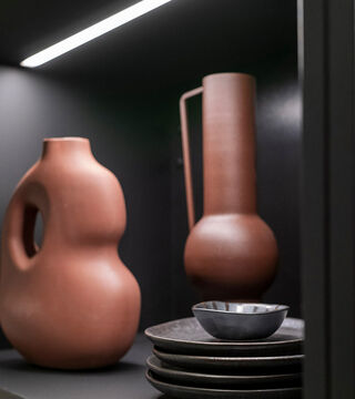
Muted colours interacting with achromatic interiors in Wabi-Sabi design - within playful diversity different trends can combine with each other harmoniously.

Discover